A site that actually dives
Dive On Scuba Center, a PADI/SSI diving school at Capo Mulini. Not a template with fish photos: an interface that literally descends as you scroll, section after section.
A directly run school
Dive On Scuba Center is founded and run by Peppe and Letizia: PADI and SSI courses from the first sea baptism to Dive Master, guided dives along the Sicilian coast, BLSD courses. 5.0★ on Google, 23 reviews. A small, direct school, not a chain — the site had to feel that way.
Before and after
No archive screenshot of the previous site: what follows is an honest, worded comparison between the starting situation and the site online today.
A minimal online presence, with no real account of the diving experience: neither the certification progression nor the direct relationship with Peppe and Letizia came through on the site.
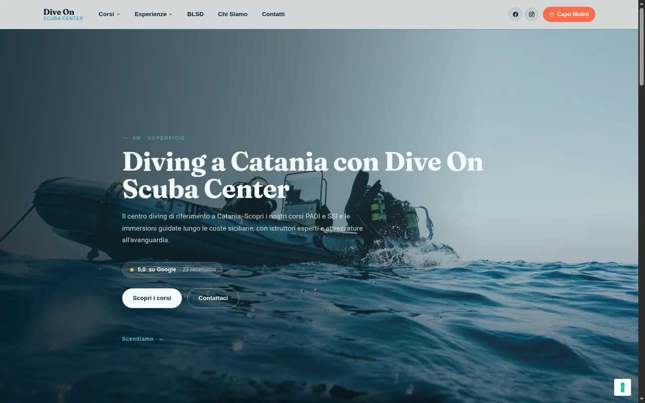
The site as a dive
Every section of the homepage is labelled with an increasing depth and the corresponding pressure in ATA — exactly like a dive computer: 0M · Surface, then 3M · the check before setting off, then the courses from 12 to 40 metres, down to the final contact point at 40M+. Not a decorative effect: the information structure follows the client’s trade.
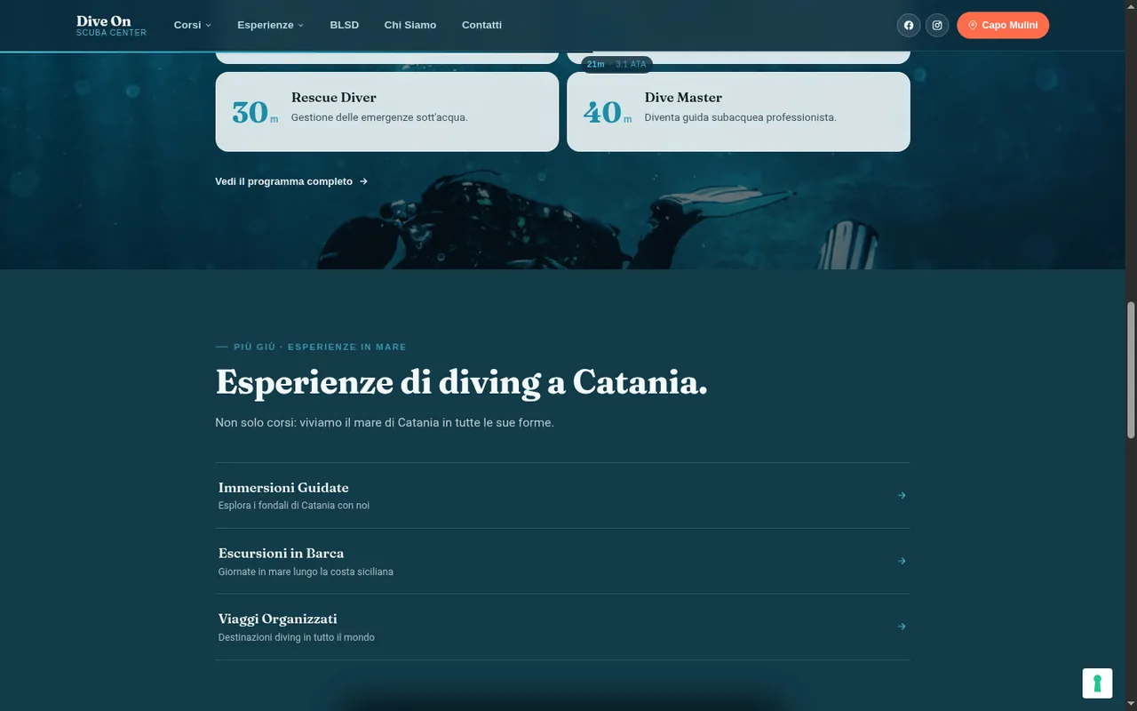
- Custom "depth gauge" styled header and footer (depth + ATA)
- PADI/SSI courses presented by depth reached, not as a flat list
- Google review badge (5.0★, 23 reviews) featured in the hero
- Direct WhatsApp CTAs to Peppe and Letizia, not an anonymous form
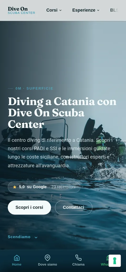
The phone version
People looking for a diving centre do it almost always from their phone, often on the beach. A floating pill header, a fixed app-style bottom bar (Home, Location, Call, WhatsApp) — the depth indicator stays readable even scrolling with a thumb.
Monitoring in progress
The redesign has just been completed: there aren’t months of Search Console data to show yet. No made-up numbers — when there are real results, this section will be updated under the same transparency rules as every other case study on this site.
What people ask about this case
Why is the site structured like a dive?
Because that’s exactly what the centre sells: a path from the surface down to 40 metres, certification after certification. The site makes it literal — every section shows the depth and corresponding pressure (ATA) as you scroll.
Are there SEO results to show yet?
No, and it’s honest to say so: the redesign has just been completed, monitoring is in progress. I don’t publish numbers until there’s real data to show — the same rule applies to every project on this site.
Can the “depth gauge” concept be adapted to other sectors?
The underlying idea — an interface that literally reflects the client’s trade instead of a generic template — yes. The specific detail (depth and ATA) stays with Dive On.
Your project could be next
A free first conversation to work out what your site needs.